DocSend Spaces for professional service users
“Spaces” is a high-value feature used for sharing a collection of files and folders securely with a single link. The current customer base is highly concentrated in startup founders and venture capitalists, which makes the product very susceptible to macroeconomic headwinds. So the mission for Dropbox DocSend in 2023 is to diversify the customer base to professional service users. I led the design efforts of magnifying the product values of Spaces to attract more users from the professional service vertical.
My role
Product design, user research
Team
Product manager, product marketing manager, content designer, team of engineers
Time
3/2023 - 4/2023
Why worth solving now?
The spaces feature is proven to be an effective driver for upselling according to data. If we can attract more professional services to try out Spaces, it’s very likely that they’d convert from trial to paid, and from personal plan to advanced plan.
Goals
Educate and provide more values of Spaces for professional service customers.
Increase Spaces activation rate to ultimately drive upsell.
Current Spaces: primarily used by founders & investors for sharing and managing sensitive documents during fundraising, M&A…

Problems
While we are seeing healthy usage among founders and investors, the activation rate of Spaces is only ~10% among professional service users.
Also, around 30% of the professional service users that we interviewed are not familiar with Spaces, despite they are subscribing to a plan that includes this feature.
Through watching user session recordings, a lot of the new users seem to find it hard to use and end up leaving the page without meaningful actions.
Research
From analyzing the titles of Spaces created by existing professional service customers (users self-identify industries from the onboarding survey), we found that they are using Spaces mainly for two use cases:
Client portal - to share and exchange proposals, contracts etc with clients.
Onboarding - to share and receive documents when onboarding a new client, or a new employee to the company.
We saw that existing users in the above use cases tend to retain pretty well. Also given the fact that the feature name “Spaces” is a bit ambiguous, I came to a hypothesis - the activation rate is low among professional service users because they don’t fully understand what Space does and how they can gain value from it.

From talking to existing users and potential customers in the professional service industry, I summarized the unique needs and wants:
Sense of connection: they tend to use Spaces during the initial discovery & proposal phases of a project, where they’d like to better promote themselves and build a sense of connection with the clients
Customization: they want to better design and customize the page with a professional and personalized look to sell their services easily
Ease of use: usability has been an issue for a notable time. Unlike our passionate customer base in fundraising, the professional service segment requires a higher quality of UX for adoption
I came to a second hypothesis for low activation rate - the quality of user experience and the flexibility of customization are the barriers.
The user journey to adopt Spaces

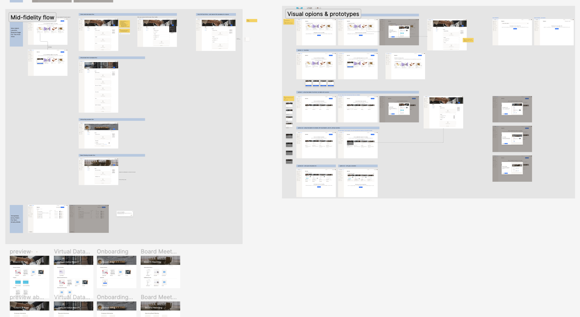
I mapped out the user journey to adopting Spaces, and prioritized and aligned with the team on how we want to build the journey. We planned to focus on awareness as phase 1 to get early signals on if there’s a solid increase in usage, before improving the actual Space creation experience as phase 2.
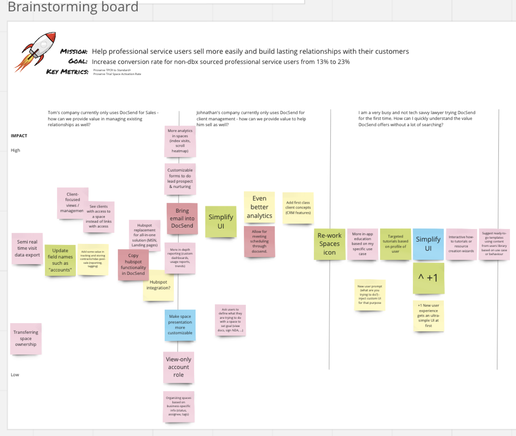
Brainstorming
With the 3 HMW statements, I started to brainstorm ideas, mock up possible solutions, and then iterate with the team to incorporate feedback.
Phase 1 solution
First-time users are presented with the new onboarding experience (I designed and launched with the team prior to Spaces), which includes a clearer value proposition message of Spaces
As users navigate to Spaces, instead of seeing an empty state, they would be introduced to Space templates. The goals of having templates are to educate new users on how they can use Spaces in a way that is relevant to their business, and to provide a simpler experience to set up a Space. The choices of the four templates for MVP are determined mindfully based on common use cases among all user segments, while prioritizing “Client portal” to tailor to professional service users.
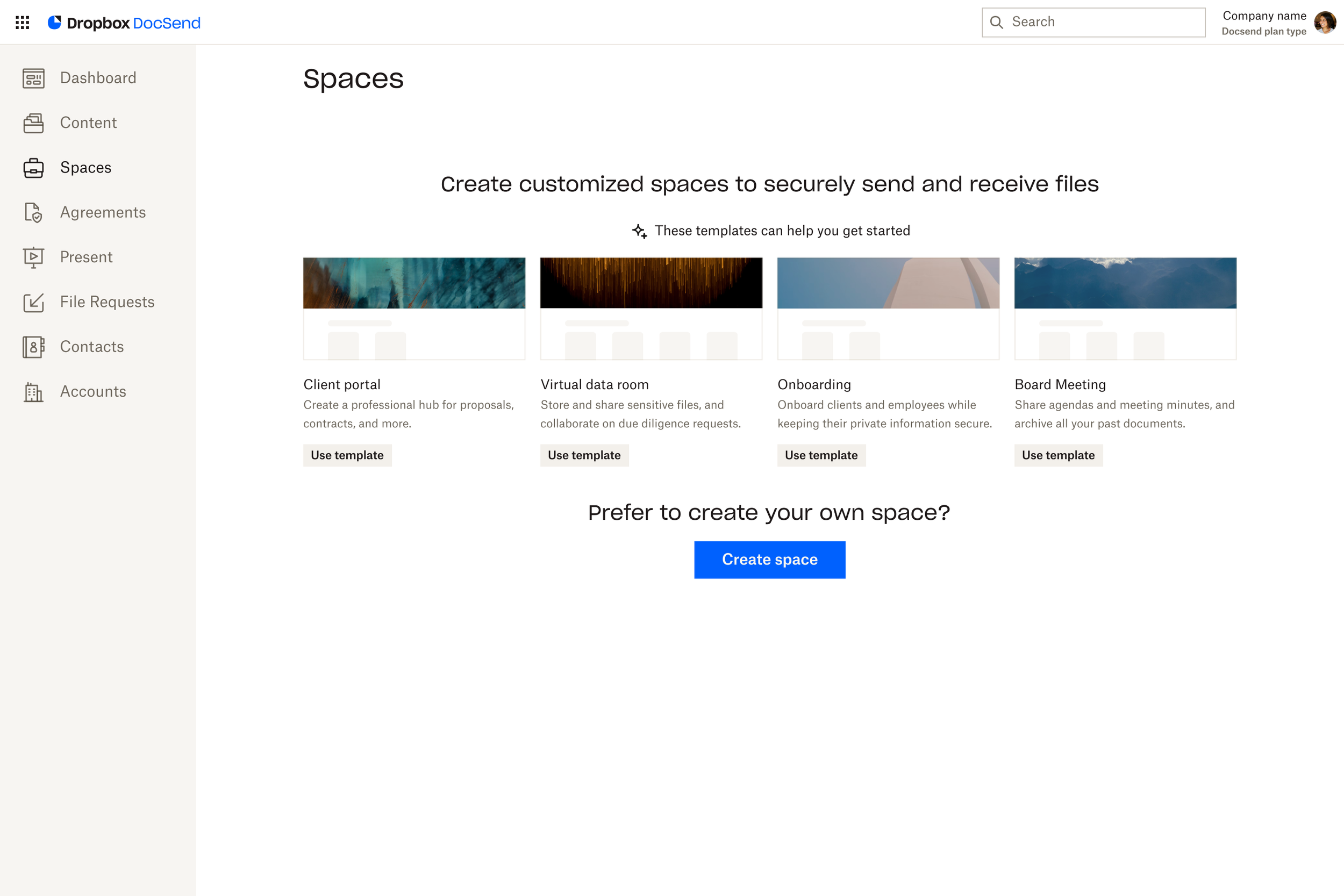
Space template provides users with sample files, customized header and sections that are relevant to the use case
Preview enables users to get a sense of what visitors will see when they share out this Space
After validating the concept of templates, we went ahead and implemented the MVP version of it. The future plan will involve investing in more diversified templates and custom templates.
In the meanwhile, I moved on to the next phase of the design to address usability and customization for users.
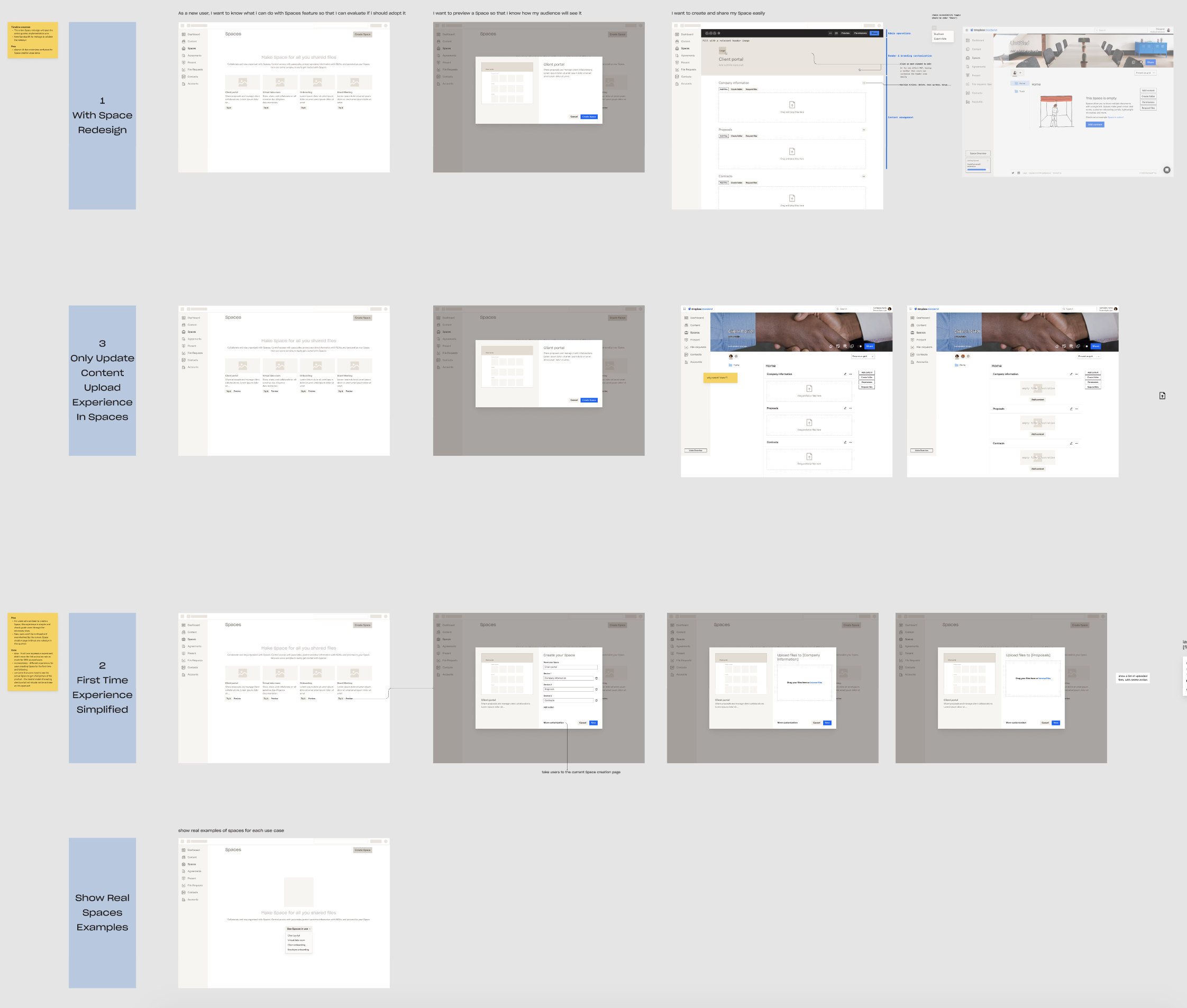
Phase 2 solution
The current Space creation experience is powerful but lacks a clear information hierarchy, making users confused about where to start.


We mapped out a detailed design & implementation timeline to align within the EPD squad. The goal is to take an iterative and agile approach, design to start a bigger picture of IA re-structure, then focus on each individual flow as engineering start building the blocks.

I first redesigned the information architecture to clarify the hierarchy of “header customization”, “content management” and “admin controls”.

Redesign based on the revised information hierarchy. The operational controls are consolidated into the “top toolbar”, where “Share” as the main call to action, with other actions prioritized based on usage. Clearing up the actions, users can focus on customization and content on the page to better design their Spaces.
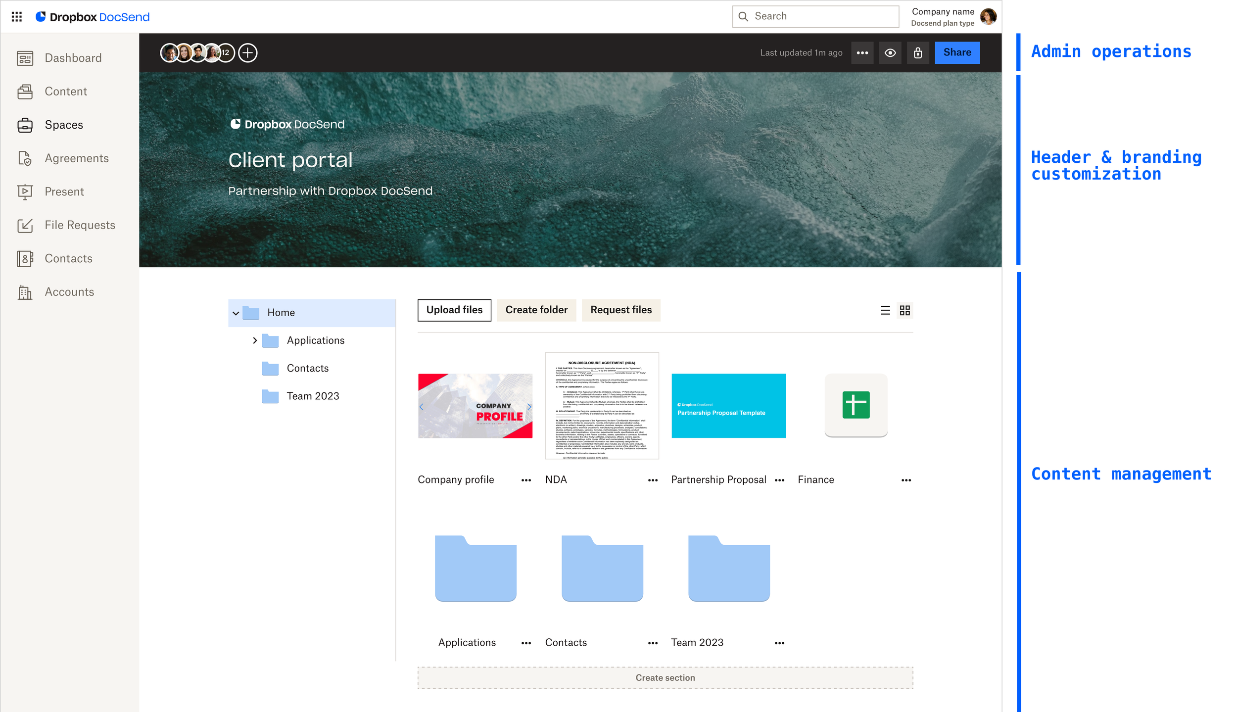
Customization as a focus:
Inline editing experience to customize the Space more easily and flexibly.
WYSIWYG experience to easily have a sense of what visitors will see.
Impact
The Spaces activation rate has lifted ~11% among professional service customers 8 weeks after launching the phase 1 of onboarding and templates.